By now, the Target bullseye logo is synonymous with a good, clean, simple design. The logo has been voted as a top design numerous times, and routinely is used as an example for what all logo designs should target (pun intended). 
You can almost picture a stamp of this logo, that's how simple it is. Without needing any words, or even the company name, this logo immediately tells a consumer what store they are entering.
What I never realized was that this design was actually a simplified version of an original, bigger logo which was used until 1968  (pictured to the right). This is where you can see the genius of the Target Corporation. The original logo is much to big..too many circles and too complicated. By simplifying things and removing the two outer red circles, the logo becomes cleaner and easier to copy. This is a logo which a kindergartner can easily draw, something which cannot be said by many companies. By moving to the current logo, the company ensured that everyone is capable of instantly not only understanding the logo, but also that anyone can easily replicate it.
Proof of the success of the design: Fortune magazine compared 16 of the top logo designs in a tournament to decide which was the top logo design. In the final, Target was able to win over he CBS eye logo. Fortune described the logo as an event, containing witty simplicity, and as being more distinct. If you want to check out the final 16, you can click here.
 The Big Ten (Big 12?) recently redesigned its logo after adding Nebraska to the 11 teams that were already in the Big Ten: Michigan, Wisconsin, Iowa, Indiana, Ohio State, Michigan State, Illinois, Minnesota, Northwestern, Purdue, and Penn State.
What I like about the new logo is that it included '10' hidden within 'BIG', similar to how '11' used to be hidden in the old logo. However, having the 'TEN' written below is almost redundant. With the '10' already hidden within 'BIG,' why would you write it out again below?  It would make more sense if they cut out the bottom half, as is illustrated to the left.
This is a solid logo redesign, especially since the previous one was made irrelevant with the addition of the 12th team. The big, bold lettering will easily be transferable across multiple mediums and provides a simple brand element.
Now, if only they could have hidden '12' instead of '10' I'd be more impressed..
 Everyone knows what the logo to the left is...it's clearly the Mercedes Benz logo. No doubt about it. It is an unmistakable logo which has stood the test of time. So, what's wrong with it?
First, what does this logo mean to you? If I were to show you this logo, you would say "Mercedes" and little else. A logo should arouse feelings and emotions within a consumer, not simply the brand. That is where this logo fails to compete with other classic logos.
Originally featured in 1909, the three pointed star represents the company's "domination of the land, the sea, and the air." I wonder, how many people would have guessed that? Not many. This is a logo that is known across the world, but only as the Mercedes logo, not as anything else. The meaning behind the logo is unclear, and not necessarily representative of what the Mercedes Benz brand stands for.
Now, by no means am I suggesting the company change the logo. We have all seen what can happen when a brand decides to mess with a logo; usually there is public outcry, since humans are resistant to change. I am simply demonstrating that the logo fails to compete with the other classic brands because it does not arouse emotions within the consumer.
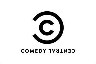
 By now everyone is aware that Comedy Central has introduced a new logo. I am probably the 50,000th blogger to comment on this fact. However, it seems as though most people are having a negative reaction to the logo. Why? What's wrong with it? If anything, the new logo is better suited for the modern era than the old one. T
 he new design, which obviously resembles the copyright mark, can easily be reproduced across multiple mediums, something which the old logo could not. If the company chooses, it can simply drop the writing at the bottom and only use the two C's.
I would imagine that Comedy Central has already made the same conclusion, but this is a great way to "copyright" all of their products. Simply place the logo at the upper right of a product, the same way the copyright symbol is placed, and it is immediately branded in an ironic way. The design is certainly not boring, as many people have commented, but it is brilliantly simple. This is a logo which can be easily replicated, enlarged or shrunk to fit the different mediums, and used ironically for humor. Of all the logo designs this year which have gone wrong (think Gap, MySpace, or OWN) this is an example of a company who got things right.
 Although the logo is only used as a throwback, no one can forget the old school Brewers logo. At first glance, the yellow and blue baseball mitt with a baseball inside is just a simple design for a baseball team. However, what makes it so unique is that the artist, Tom Meindel, an Art History student at the University of Wisconsin-Eau Claire, incorporated the "m" and the "b" into the mitt.
Introduced in 1977, the logo lasted for 16 seasons with Milwaukee before being replaced in January of 1994. I still remember walking around campus as an undergrad and seeing a throwback Brewers hat and thinking it had to be one of the simplest designs ever. For some reason, maybe I'm just slow when it comes to design, it took me until then to notice the "m" and the "b" hidden inside the mitt! At this point, it became one of my favorite sports logos of all time. If for no other reason, then appreciate the logo because it replaced this:
I may be biased in evaluating this logo, but I love when a company (or a team) can hide something within a logo. I doubt this was the first, but it definitely helped lead the way for logos such as the Amazon "smile" or the FedEx "arrow."
If you want to see more about the history of the logo, check this out.

For this post, I wanted to look at a company which recently redesigned its logo. The obvious choice would have been Gap, which we all know made a drastic mistake and quickly caved to consumer pressure to switch back to the original logo. Another company has decided it was time for a makeover, and it again has mixed reviews.
PricewaterhouseCoopers, one of the Big Four global professional services organizations, renovated the logo to be "better suited to digital and online use." The new design, which was officially rolled out on September 20th, simply contains the lowercase "pwc" and an object which looks like a colorful flower. However, if this logo gets printed in black and white...it turns into a random collection of boxes which makes no sense at all.
 So why the switch? Quite frankly, I think the company needed to change to something. It may just be me, but the old font made the logo look like something out of Nightmare Before Christmas. It definitely was not representative of what the company is, and it needed a change. A company like this
  needs a strong, simple, professional logo. Even if the new logo was simply "pwc," I feel like that would be better than the new flower design or the older one.
I still have not figured out why companies feel the need to tinker with logos, and how they come up with some of these designs. Maybe one day it will make sense, but until then, companies like Gap and PwC will continue to pay designers to come up with these logos which "embody" the brand. Maybe they should take a note from Target, one of the companies which got it right.

Chances are that you either use AT&T or Verizon as your cellphone provider. Sure, there are other companies out there like T-Mobile, metroPCS, Sprint, and Virgin Mobile, but most people use one of the main two. Although I'm not crazy about AT&T's logo either, it at least makes sense. The logo symbolizes a globe and represents the world being circled by electronic communications. Again, this makes perfect sense. It is a smooth logo that almost makes you feel comforted when you look at the 3D design. It certainly does not have the sharp and jagged edges of the 2012 Olympics logo.

Now, when looking at the Verizon logo, it makes me cringe. It certainly does not have the smooth feel that the AT&T logo has, and the choice of red and black colors reminds you of a villain, not a cellphone provider. The name Verizon comes from the combination of two words: "veritas", a latin word meaning truth, and "horizon."
The "V" on top of the logo is off kilter and does not match the angles presented in the rest of the design. Then, there's the red Z which does not belong in this design. I'm honestly not sure of what the extended bottom of the Z stands for, but I assume it is representative of a "horizon" somewhere at the end.
Although the Verizon logo is not nearly as bad as others, it still ranks as one of the worst. There is an argument that it clearly does not matter, especially considering how dominate Verizon is, but the logo needs to change. It is gaudy and does not, in any way, represent what thoughts come to mind when a customer thinks of Verizon.