 By now everyone is aware that Comedy Central has introduced a new logo. I am probably the 50,000th blogger to comment on this fact. However, it seems as though most people are having a negative reaction to the logo. Why? What's wrong with it? If anything, the new logo is better suited for the modern era than the old one. T
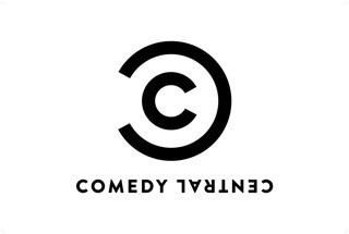
I would imagine that Comedy Central has already made the same conclusion, but this is a great way to "copyright" all of their products. Simply place the logo at the upper right of a product, the same way the copyright symbol is placed, and it is immediately branded in an ironic way. The design is certainly not boring, as many people have commented, but it is brilliantly simple. This is a logo which can be easily replicated, enlarged or shrunk to fit the different mediums, and used ironically for humor. Of all the logo designs this year which have gone wrong (think Gap, MySpace, or OWN) this is an example of a company who got things right.
No comments:
Post a Comment